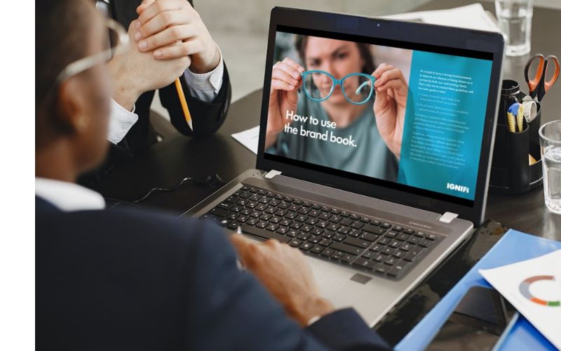
In a dynamic marketplace, staying relevant is crucial for any brand. A brand refresh is a key step to maintain connection with your audience, especially when it comes to your visual identity and messaging. IGNIFI recently underwent this process, culminating in a new ‘Brand Book’ that is currently being rolled out across our assets and platforms.
This blog will explore the five critical factors to consider when visually refreshing your brand, with our Senior Creative, Marc Jeffrey sharing insights from our own journey at IGNIFI.
1. The Importance of Visual Identity
Your brand’s visual identity is the most visible expression of who you are. This includes your logo, colour palette, typography, and overall design aesthetic. These elements should not only be visually appealing but also embody your brand’s core values and help differentiate it from competitors.
A brand refresh provides the chance to reimagine these components to reflect your brand’s growth or shifts in the marketplace. However, consistency is important, and customers should still recognise your brand, even after updates.
Approach this process not as a change, but as an evolution of your brand. The goal is to maintain the recognisable visual elements that HCPs and patients identify with, while ensuring it remains visually attractive and aligned with your core principles.

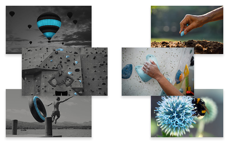
“At IGNIFI, our previous visual identity, with its greyscale imagery and blue accents, served us well for many years. We embraced the opportunity to refresh our look, bringing a vibrant new appearance to our assets.
We opted to replace the greyscale brand imagery with full- colour visuals, keeping our signature blue highlight on the enabling element of the image to retain familiarity. Our refreshed brand image library is guided by the principle that every image should feature a living element. This symbolises our passion and dedication to providing life-changing value, whether in a literal or metaphorical sense.”
2. Logo Evolution
Your logo is one of the most powerful symbols of your brand. In most healthcare and pharma contexts, a full redesign is rarely needed or likely to be considered. However, small refinements can be highly effective in evolving your brand while preserving its core identity. The key is to retain recognisable elements, ensuring that existing customers still feel connected to your brand while attracting new ones.

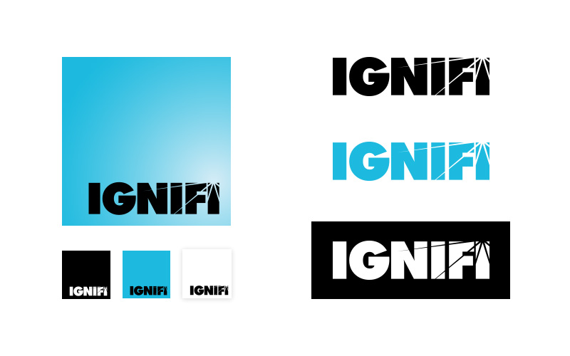
“IGNIFI’s blue square chip logo is a distinct and recognisable element of our brand, but in cases where space is limited or the background colour clashes, we switch to using the black wordmark.
We have made no changes to our logo during this refresh, but established new guidelines for pairing the blue logo with our signature blue elements now that we’ve transitioned to using full colour imagery.”
3. Updating Colour Palette and Typography
Colours and fonts play a crucial role in shaping customer perceptions and emotional connections. If your brand values or target audience have evolved, refreshing your colour palette can ensure it reflects your current positioning. Exploring entirely new colours might not always be possible, but introducing new gradients or complementary shades to your brand palette offers an opportunity for progressing your visual appearance.
Typography, too, speaks volumes about your brand. Choosing fonts that complement your visual identity while being legible and functional across platforms is essential.

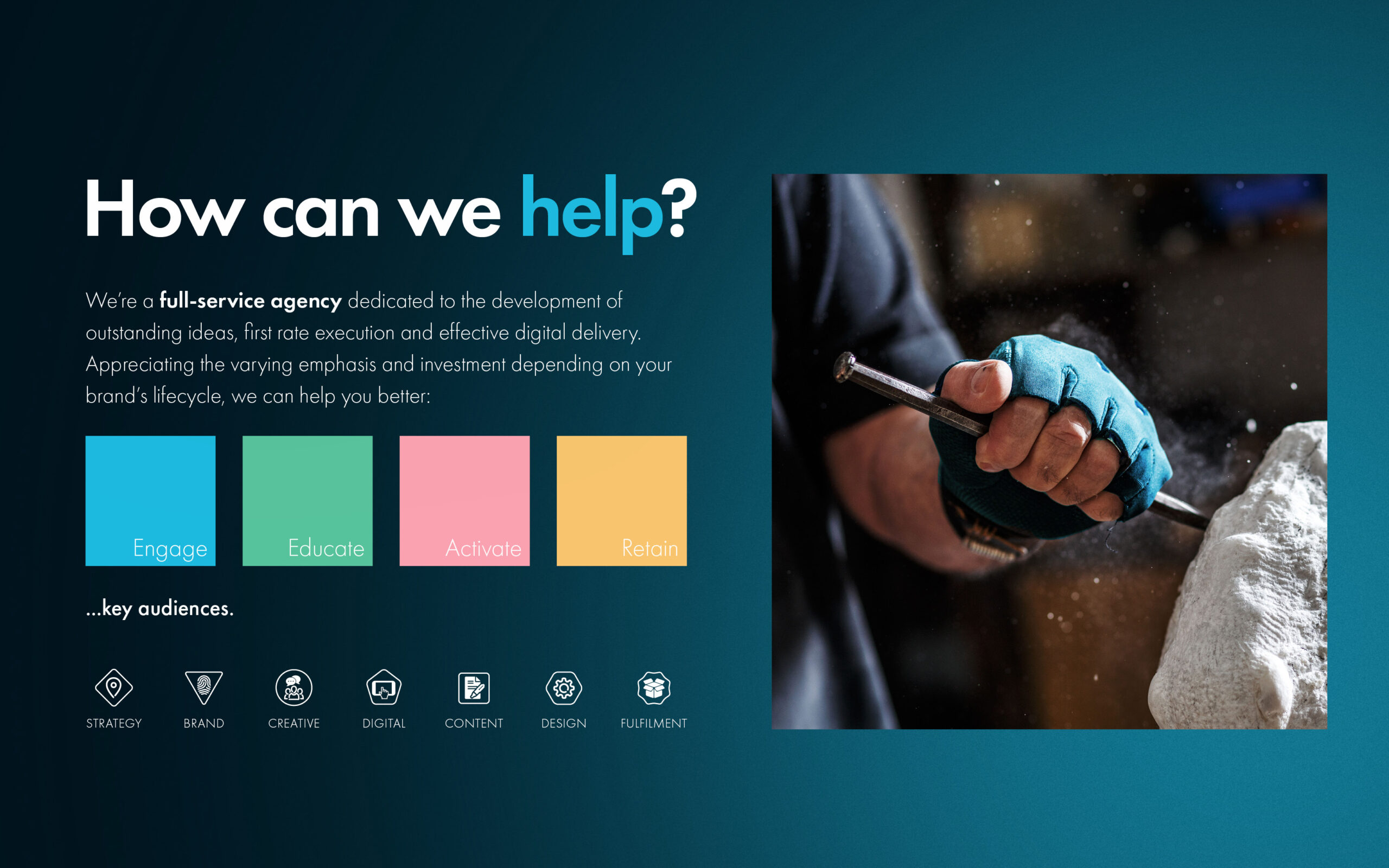
“Our creative team recognised that expanding beyond our original palette of white, grey, and IGNIFI blue would provide greater design flexibility. By introducing some warmer colours into our brand palette, we’re now better equipped to create visuals that evoke warmth and reflect our commitment to building connections between our clients and their audiences.
We have expanded our colour palette and incorporated a versatile spotlight background option that seamlessly integrates into various materials, such as presentation decks and social media assets.”
4. Aligning Messaging with Visual Identity
A strong visual identity needs to be paired with clear and consistent messaging to fully tell your brand’s story. Messaging includes tone of voice, key messages, and the way you communicate across channels. A brand refresh is the perfect opportunity to revisit and realign your messaging to match your updated visuals and brand values.

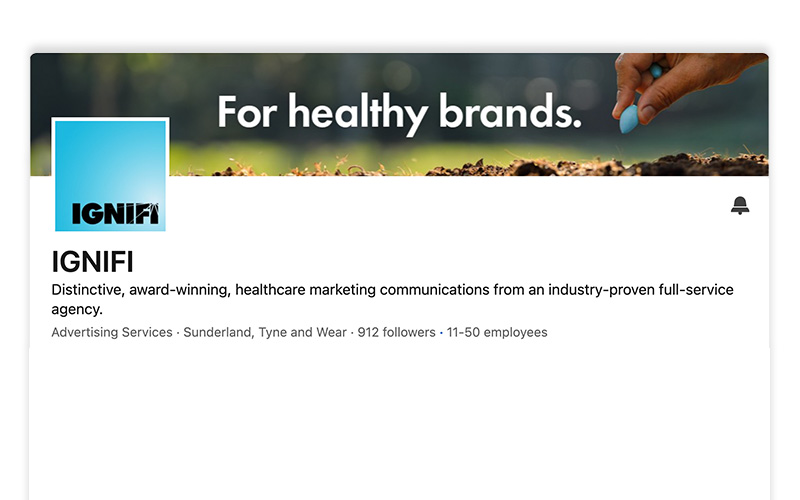
“At IGNIFI, we introduced a former tagline ‘For healthy brands’, which compliments our updated visuals while communicating our focus more directly and succinctly. We’ve also introduced four key pillars — engage, educate, activate and retain that sum up what we deliver to our clients.”
5. Testing and Gathering Feedback
Testing your updated visual identity and key messaging with your audience is a crucial final step in any brand refresh. Feedback ensures the changes are perceived as a natural evolution of your brand while preserving key visual elements. It also helps identify any areas that might benefit from further refinement.

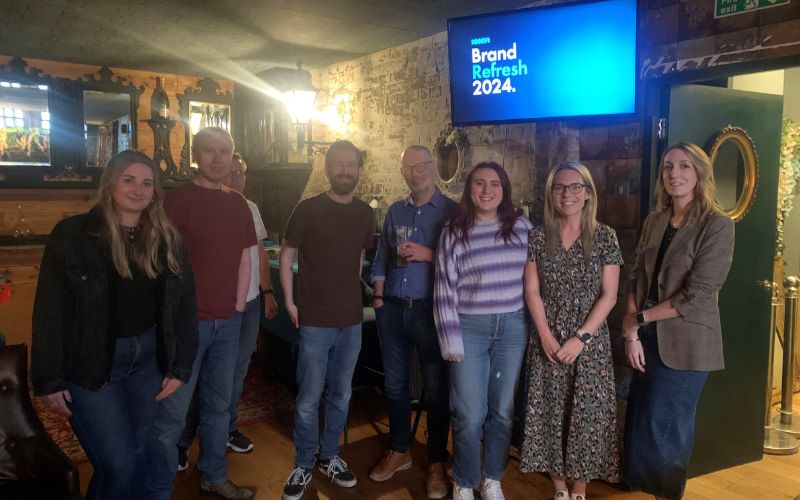
“At IGNIFI, our brand refresh was a collaborative process involving teams from Creative, Design, Digital and Client Services. We ran tests on our social media, comparing new visuals with previous ones to see which resonated best with our audience. Internal alignment was just as important, so we held a brand refresh meeting for our team, encouraging feedback and adjusting before our external launch.”
Refreshing your visual identity and messaging can breathe new life into your brand, helping it stay competitive and relevant to both new and existing audiences. By taking a strategic approach, like we did with our own refresh, you can ensure your brand continues to reflect your evolving values while maintaining a strong market presence.
Is it time to give your brand a fresh look? Contact us to learn how our creative experts at IGNIFI can help you evaluate your visual identity and messaging and support with updating your marketing assets.

